# How to vertically center text and HTML elements with CSS
Vertically centering something in CSS is not as easy as you'd think, and until we got tools like **flexbox**, it was really hard. Fortunately, vertically centering something within a container is quite easy now. Let's look at how to accomplish it.
## Vertically centering an item in CSS
Let's assume we have some simple HTML with a div called `.item` within a container called `#container`. Our HTML looks like this:
```html
```
When we create this, our output is going to look like the example below. By default, `.item` will be full width, and at the top of the container.
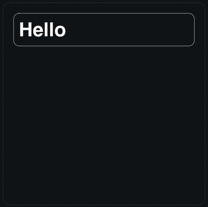
To rectify this and center our `.item` div containing the text, "Hello", we need to make `#container` a flexbox. To simply center the flexbox vertically, we only have to update our container CSS to look like this:
```css
#container {
display: flex;
align-items: center;
}
```
Resulting in this outcome:

If we want it to be both centered vertically, and also centered horizontally, then we would update our `#container` CSS to look like this:
```css
#container {
display: flex;
align-items: center;
justify-content: center;
}
```
Resulting in the following:

[A demo showing the full code for this example can can be found on codepen here](https://codepen.io/smpnjn/pen/OJvVrMN).
## Centering an item in the middle of the screen with CSS.
This works fine if we want to center something within a div element, but what if we want to center something exactly in the center of the user's screen? If we want to center something in the middle of a user's screen with CSS, we can still use `flexbox`, we just need to adjust the width of the container. This time, we'll make `#container` have a width of `100vw` and a height of `100vh`.
These two units tell the browser to make `#container` width and height to match the full width and height of the viewport. We can still keep the same HTML:
```html
```
However, our CSS for the `#container` element will now be adjusted to add in this new width and height. I've also added `box-sizing: border-box`, so that `#container` doesn't overflow and cause scrollbars to appear:
```css
#container {
box-sizing: border-box;
width: 100vw;
height: 100vh;
display: flex;
align-items: center;
justify-content: center;
}
```
Again, [a demo of this example can be found on codepen here](https://codepen.io/smpnjn/pen/bGvdOBq).
## Conclusion
Centering items in CSS is really easy with flexbox. If you want to learn more about CSS, I've created an [interactive guide to flexbox](https://fjolt.com/article/a-guide-to-css-flexbox). Not only does it let you center items really easily, but the guide shows you how different flexbox properties work.
[If you want more CSS content, you can find it here](https://fjolt.com/category/css).